Echo Food Shelf / Branding
(2022)
Challenge
Echo Food Shelf is a community based organization providing free access to food for those in need. Echo struggles to bring people in, as there is often a stigma about utilizing food shelves. They needed a refresh that helps them stand out and create a space that brings the community together in a unique way.


Solution
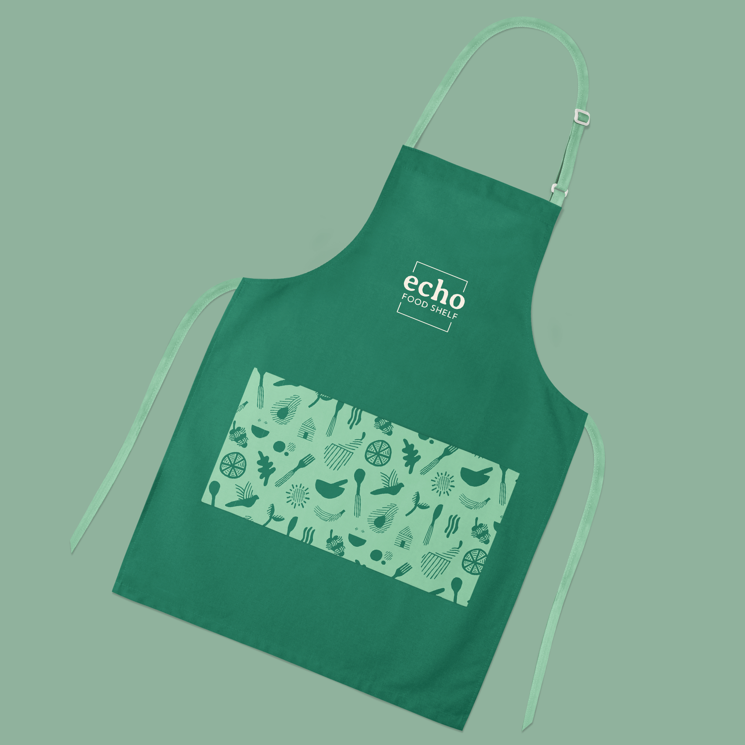
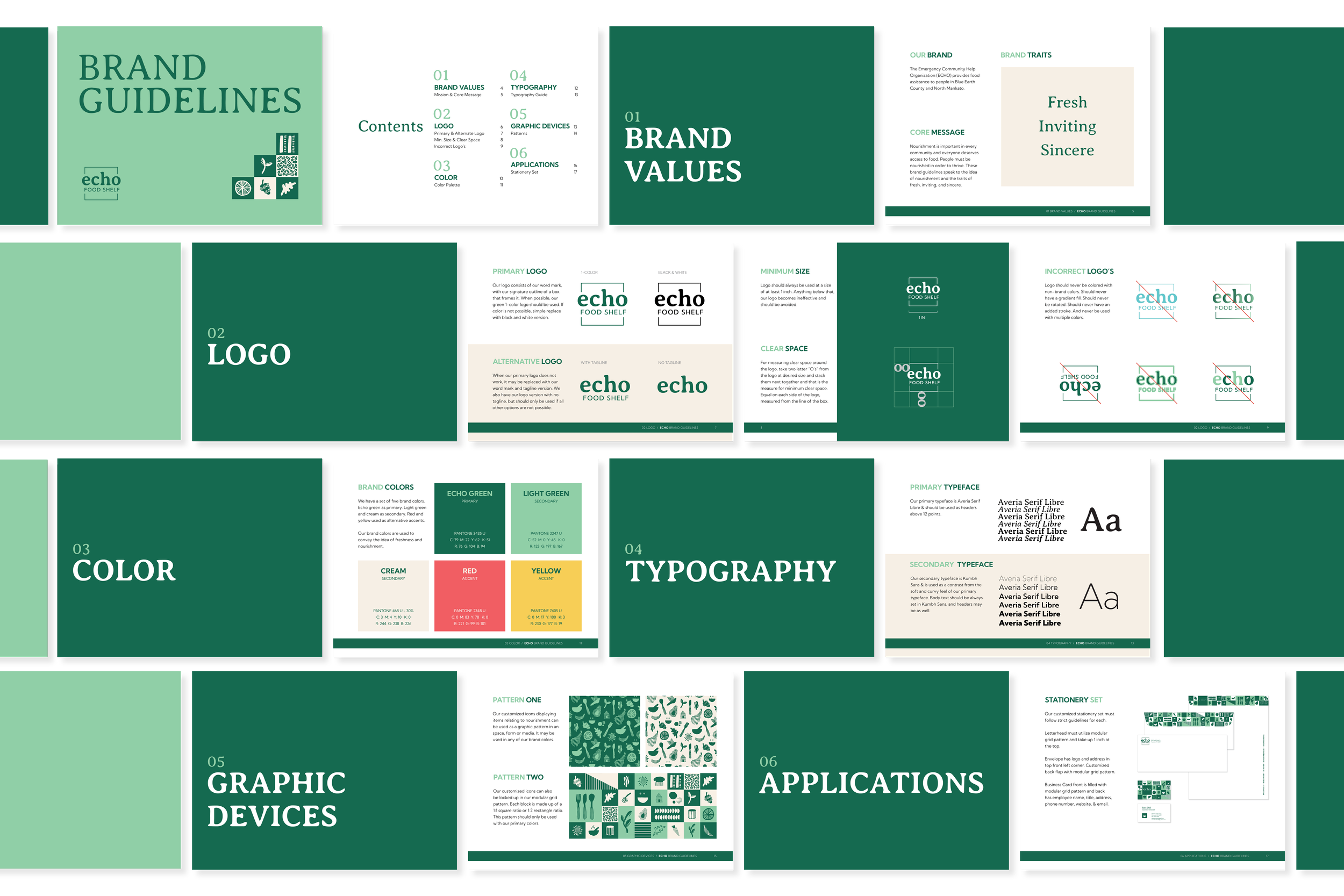
The primary goal of this brand identity was to help Echo feel friendly. Their biggest weakness was their appearance. The approach was to position Echo more as a grocery store rather than a food shelf. A main driving factor was nourishment which empowers their community. The goal was to get people in the door, feel nourished, & thrive. Fresh, inviting and sincere colors, hand drawn illustrations and patterns are what supports this main idea.


