Wild Hot Sauce / Branding & Packaging
(2023)
Challenge
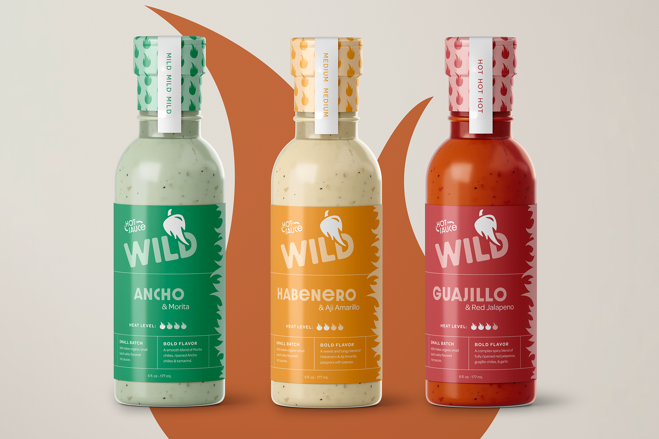
Wild is an organic but striking hot sauce brand that is nothing less than bold. Wild’s products pack a punch and the flavors will leave you feeling wild. They needed a brand identity system that strikes on energy. Fueling from flames, wild will keep you on your toes.
Solution
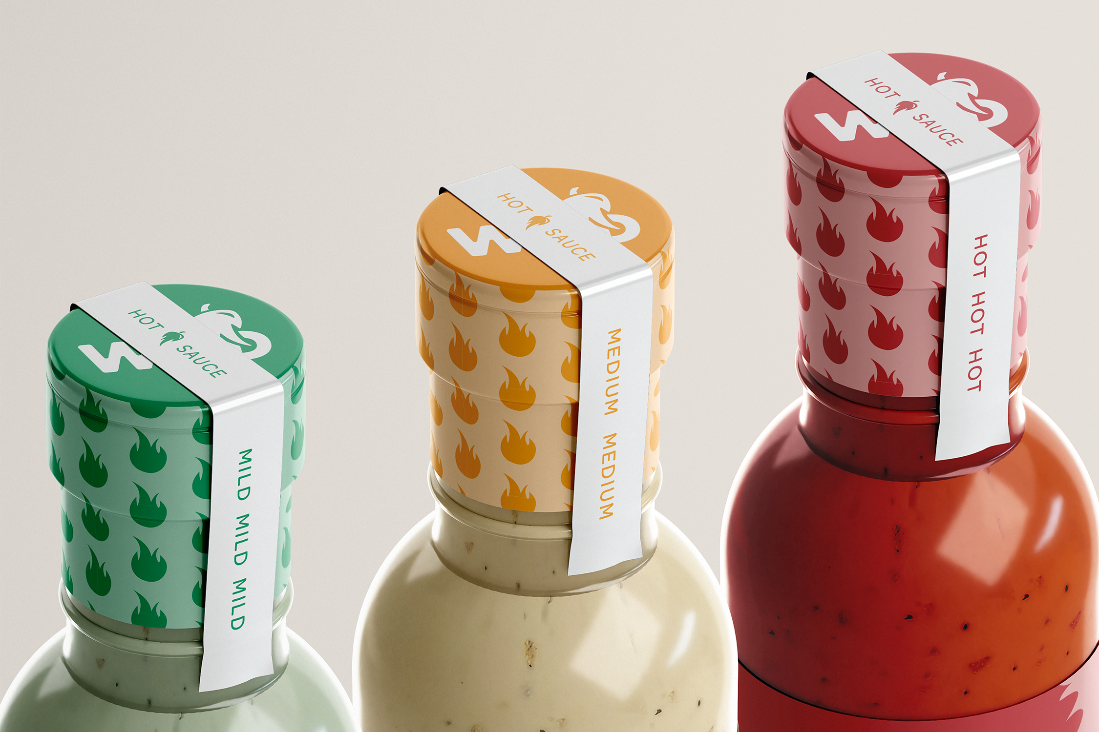
Wild was what we wanted to feel in this brand identity but not wild in a traditional way. The use of a flame combined with a pepper created a mark that was fitting but also one that stood out. This was merged together with a simple and bold wordmark , organic colors and an elegantly sophisticated aesthetic. The goal was to differentiate them in the crowded space of hot sauce with these qualities.


Process Insight
Phase 1 of the project is shown below. This complete packaging concept was developed, and then edited after taking a look at the needs of wild. The first round concept was too traditional and did not meet the goals of the project brief in regards to color, typeface, and textures. It was realized that this concept was not doing enough to help them stand out. The logo was strong, but the branding and packaging was sent back to the drawing board.
In the final direction, color and layout was highly important to focus on. Wild is sophisticated in their ingredients, so the design was cleaned up to meet their needs and help them stand out.


